Refine Your Website: “No Headers Found” – a tale of website woe
Welcome to the first article in our new series “Refine Your Website”. The idea behind this series is to present you with simple ways to check on the health of your website and give you ways to improve it. This is very much aimed at the layman/hobby developer/frazzled small business owner who built their own site so if you’re looking for in depth technical articles I’m afraid you’re in the wrong place!
As today is Global Accessibility Awareness Day I thought we would kick off with a quick and easy accessibility topic. Website accessibility is all about making your website play nicely with the kind of technology that people with disabilities use to access the web. This includes specialist software like a screen reader and also standard web browser features that you personally may not be aware of but are vital to someone out there, like being able to browse the web without using the mouse by using the TAB key to move from link to link (give it a try! The ‘Enter’ key activates the link).
Headings, Accessibility (and SEO)
One of the best ways that you can improve your website for people who use screen readers (mostly people with difficulties with their sight) is by having a good header structure. If you’ve written anything, ever then you know what a heading (AKA header) is – there’s one just above this paragraph that says “Headings, Accessibility (and SEO)” for a start.
Headings are (usually) really easy to spot on a web page if you have good eyesight, and make it nice and simple to skim through the content to see what it is about. But what about if you can’t easily see the page? We need some clever way of making those headings clear to the web browser so that it can make them available to whoever is using it, however they are using it. That way everyone can skim read the page to get an idea as to what it is about, even people who can’t physically see it. Fortunately that is dead easy – HTML has the in built tags <h1>, <h2>, etc. all the way down to <h6> that you can use to show the world not only that you have headings on your page, but also how they relate to one another. Check out the headings page on w3schools.com and give it a spin yourself, it’s certainly not rocket science.
There is an extra added bonus to using headings properly for the small website owner. Just like you, Google and the other search engines like to skim-read through pages. Using headings properly means that Google and its frenemies get a much better idea of what your website is about, which means better search engine rankings. This really is win-win!
How to Test the Headings on Your Site
Nuts and bolts time – having piqued your interest how do you go about checking the headings on your site? Here is one simple method:
- Open up the Firefox web browser (don’t have it? You can get Firefox for free here)
- Install the ‘Accessibility Evaluation Toolbar‘ add-on by Jon Gunderson.
- Restart Firefox
- Go to the web page you want to check
- Choose “Navigation” then “Headings” on the new toolbar
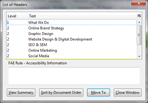
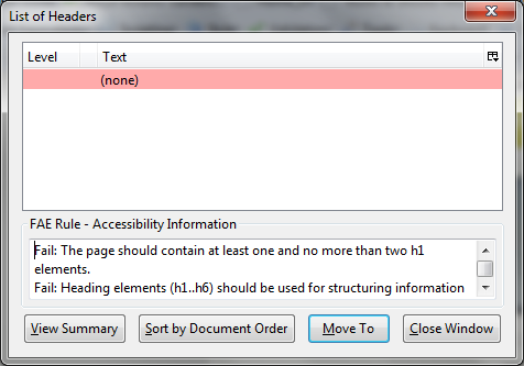
- A dialog box opens up telling you all about the headings on that page
That’s it! Take a look at the output of the tool to see if the headings it reports match the ones that you see when you look at the web page. If things are missing or different then try adding heading tags (<h1>,<h2>, etc.) to the website code. Check out the headings page on w3schools.com for a quick and easy guide.
For the visually minded amongst you, this result is good (taken from our own “What We Do” page):

And this is very, very bad (no names, but it is a real, live example, I promise):

More examples and tutorials
If you found this useful please check out the rest of our Refine Your Website series. Our article on skip links might be particularly interesting in you are looking to improve the accessibility of your website.