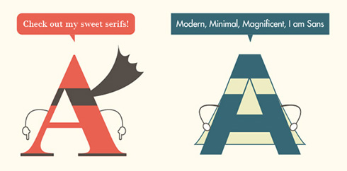
Inspired by the infographic shown on Urbanfonts.com, we thought we’d throw in our two pence worth on this topic. So … Which is better to use and when, serif type or sans-serif type? This debate that has raged in the minds of designers (and procrastinating students) for decades. Is there a winner in this war? […]
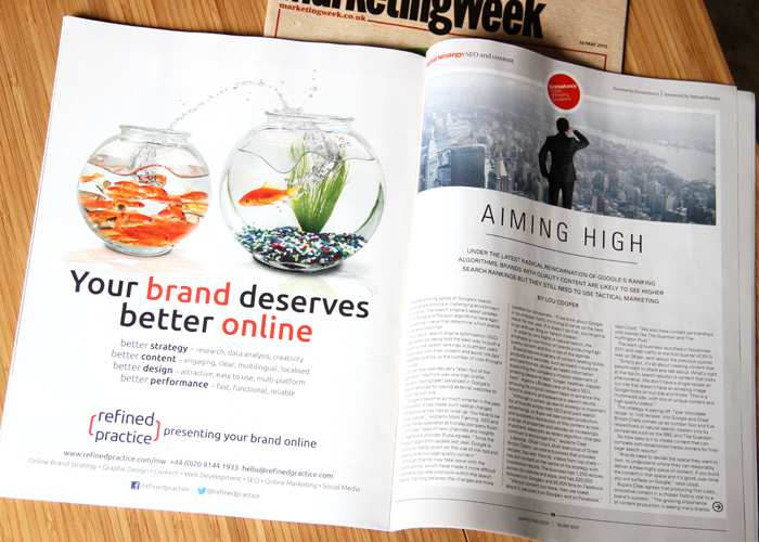
Refined Practice recently has an opportunity to advertise in Marketing Week, and below are photo’s of the advert and article. You can still read the article online which includes Roland’s viewpoint. If you’d like, please feel free to download a PDF of our advert for a closer look. If you would like us to help with any of […]
You may think that the layout of any particular design is purely left to the designers whim and, although some elements may be nicely aligned, mostly they are placed on the page or screen wherever the designer feels like it. In many cases you’d be right, but this is not how things should be … […]
With as many typefaces as stars in the sky, how do you come to a decision of which typeface to use for your project? Here are some useful areas of thought that we would consider when starting to put design ideas together … Context – In what environment will the type be used? Will your chosen typeface […]
Back in October 2012 TYPO London happened. With a host of great speakers on a topic closely related to our line of work it seemed sensible to acquire some tickets and go along. Thankfully a friend, Peter Gregson, was speaking about the Listening Machine so tickets were found for free. Thanks Peter! Social Design Designers being social was the underlying […]


